Grid control
Home –> AgileDialogs design guide –> Grid
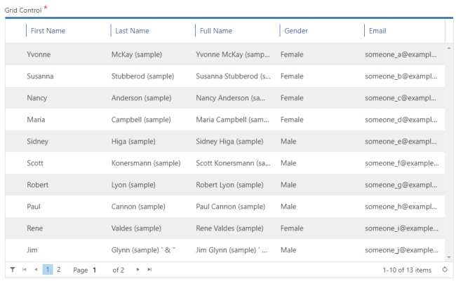
This control presents a grid with the records selected with a query configured using the Configure button.
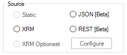
Grid control can populate its items from one of these values:
- XRM: Grid control populates its items from the results of XRM query.
- JSON: Grid control populates its items from AgileXRM variable which contains a JSON value.
- REST: Grid control populates its items performing a REST call and getting its elements from the response of REST service.
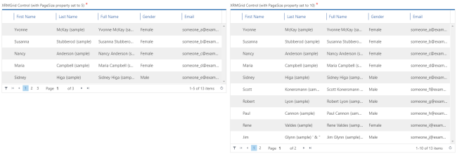
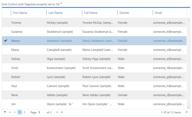
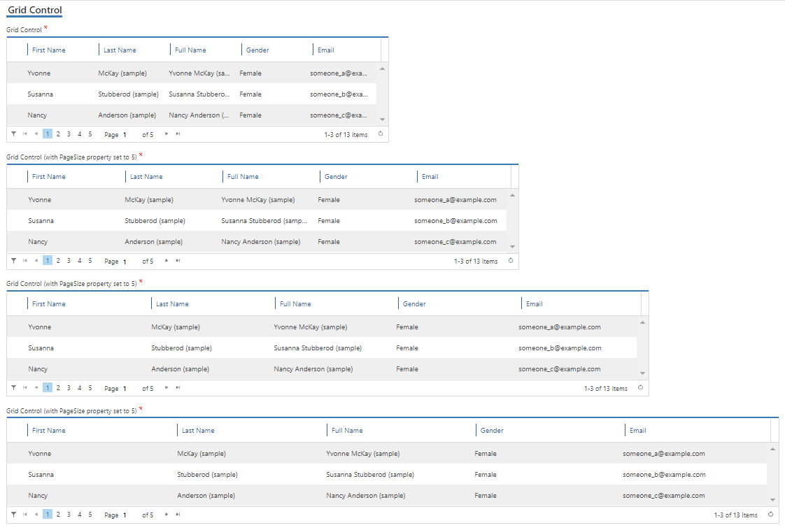
It has Paging functionality with Page Navigation buttons. The PageSize parameter (default 10) controls the page size, and a value of zero disables paging and returns all records.

Grid control configuration
Data configuration
Grid control can show data from by 2 ways:
- Dynamic: Choose Dynamic option and use Configure button to open the editor. XRMGridControl_03_01.png
This option shows data from Dynamics CRM/CDS entities using a query expression.
How to configure QueryExpression - External data: Choose Extenal data option and use Configure button to open the editor.
This option shows data from JSON value stored in Process context, that has been readed using a previous activity call (usually a REST activity)
How to configure external data
Configuration
This control can be configured to behave in 3 different ways:
- Allow single selection: in Advance tab set AllowMultiple property to false.
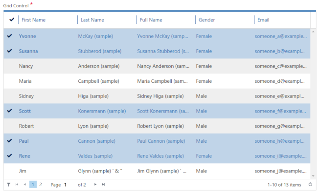
- Allow multiple selections: in Advance tab set AllowMultiple property to true.
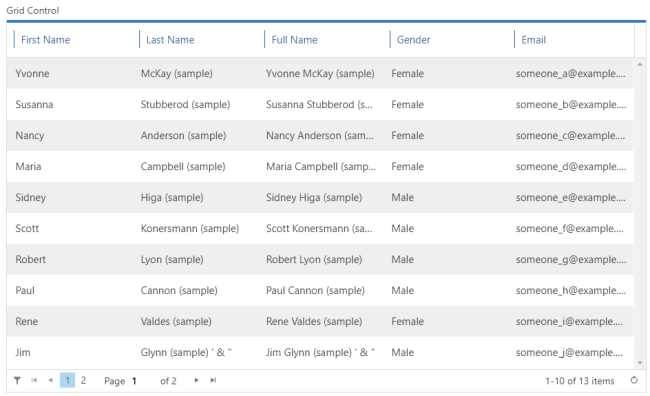
- Readonly: In Advance tab set ReadOnlyGrid property to true. This behavior is useful for summary pages:
Note that this control does not have the ControlWidth property and occupies the full width of space set by ColumnSpan.
This control also allows the following configuration settings:
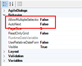
- The AutoNext property, if set to true, enables the control to move forward, once the user has filled in the control with the desired value.
For instance, if we have a Page Form composed by one Grid control, with its Required property set to true we would need to select an item inside our control, and press the predefined Next button afterwards to keep on progressing in our dialog; if we set AutoNext to true, the process will continue right after we select a value of our Grid, without pressing the Nextbutton.
Note: the AllowMultipleSelection property should be set to false.
Two Important features to take into account:
- The AutoNext property cannot be set to true in a Grid that has its AllowMultipleSelection set to true. For AutoNext property to be work, the Grid must be set on Single selection mode.
- Be careful changing both properties, because setting AllowMultipleSelection to true automatically toggles AutoNext property to false, and vice versa.
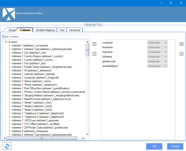
- The fields presented in the grid are configured using Configure Lookup button, and configuration in the Columns tab:
When multiple selection is allowed, the values selected by the user are stored in the ValueVariable and DisplayVariable separated by semicolons. This format can be used in other AgileXRM shapes like Update Entity (Multi).
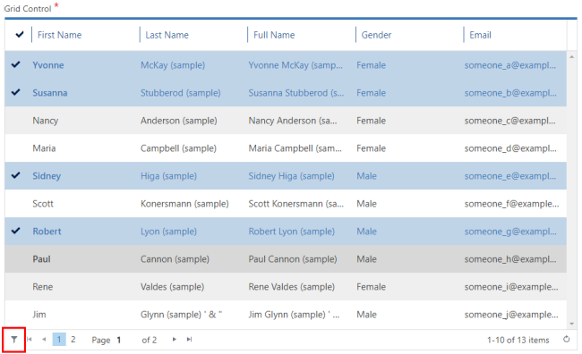
When multiple values are selected in Grid control , selected values can be located in different grid pages depending of the user selection. We can filter selected data clicking the filter button of Grid control placed at bottom left.
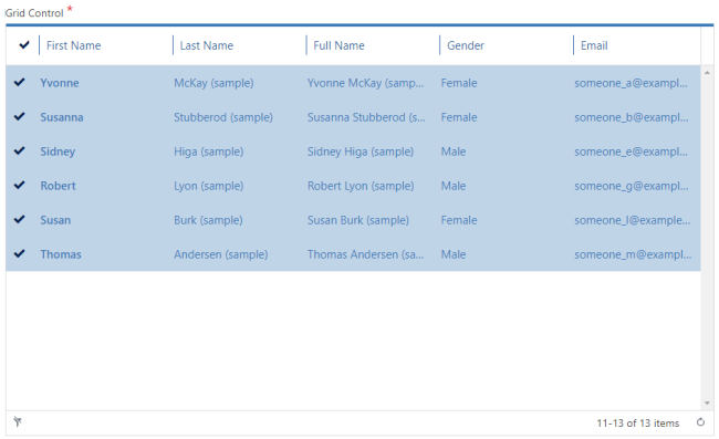
 Once Grid control is filtered, control only shows selected data. Click the filter button again to remove the filter.
-
The UseRelativeDataFormat property determines how Datetime columns are shown. When its set to false, Datetime column are shown using the CRM/CDS date format.
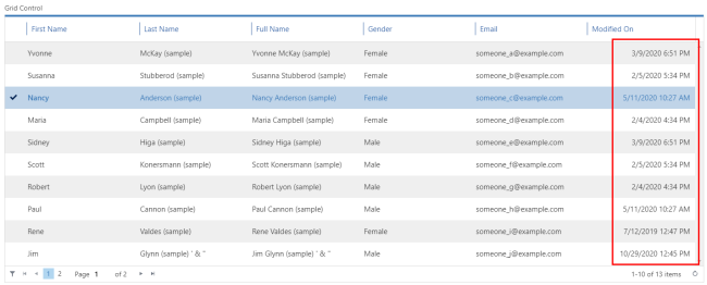
When its set to true, Datetime column are shown as friendly relative text and we can get the Datetime value by cross button.
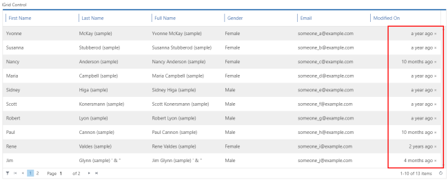
Note When Grid control is configured with UseRelativeDateFormat, we can use the cross button to show the Datetime value
