Group Container control
Home –> AgileDialogs Design Guide –> Group Container Control
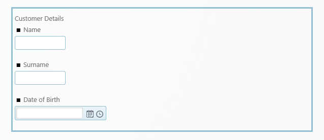
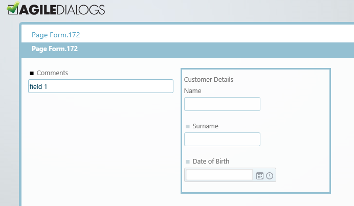
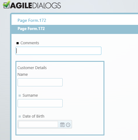
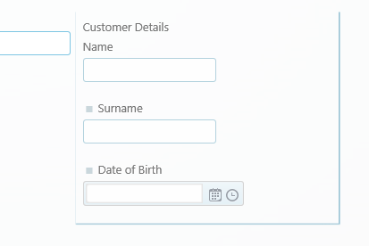
The Group Container allows us to build a certain set of controls inside a same group container, for functional and / or decorative purposes. We can group different kinds of controls (textboxes, combos, calendars, etc.) inside this container, and we also can validate all these inner elements as a whole or toggle its visibility through the container properties.
How to create a Group Container in a Form
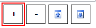
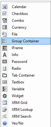
The way to add a new group container would be through the add control / Group Container options.
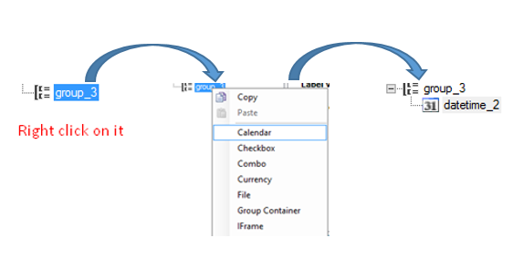
Once we added the group container to the form, we will proceed to place our inner controls inside it. We have to position into our control and add the desired elements right-clicking on it
The properties for the Group Container control are:
-
AllowAlign: If activated, the container would position inline to the other elements next to it.
If set to false, the group container will be aligned as a block and will not allow other elements to be positioned beside it.
-
ColumnSpan: this property can be modified for the element to adjust its width inside the canvas, from a minimum of 1 column to a maximum of 12 (the actual canvas width).
-
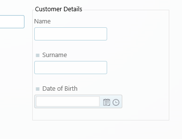
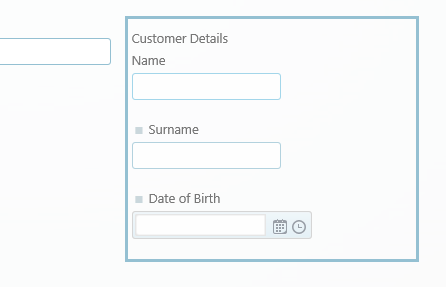
GroupType: this property controls the appearance of the actual group container to be shown in the canvas.
-
None: the group container will not have any special appearance or borders to separate it from the rest of the canvas elements.
-
FieldSet: the group container will have a leading title and a line delimiter. There will be a margin between the container and the elements surrounding it.
-
Panel: the group container will be locked inside a thicker delimiter (title included). There will be a margin between the container and the elements surrounding it.
-
Box: the group container will be locked inside a thin delimiter (title included). There will not be a margin between the container and the elements surrounding it.
-
Visible: controls if the control is visible to the user. This can be adjusted on runtime to improve performance or include new application functionalities.
Height: Optional property. Handles the height of the Group Container (in pixels). Useful in cases in which there are various group containers, aligned horizontally, with different content, and we want them to have the same height for layout purposes (image below).
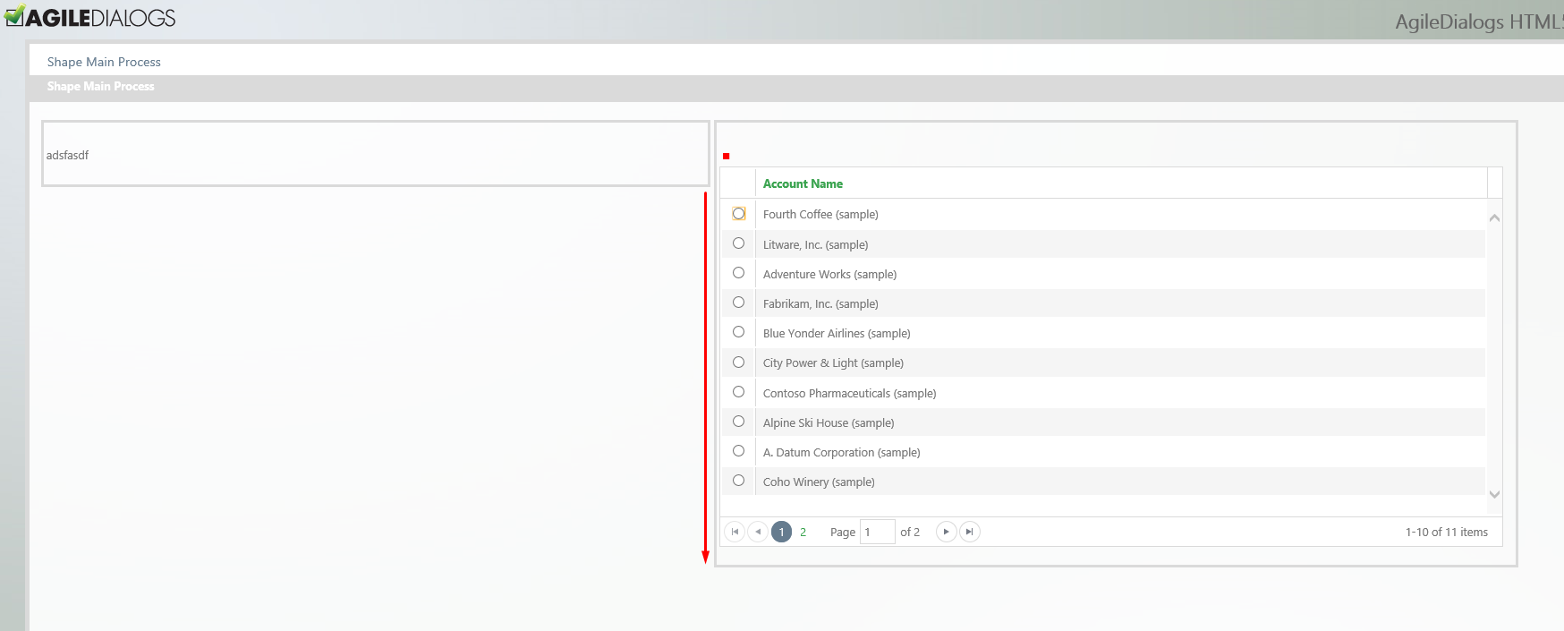
Figure 6. Two aligned group containers, the first one does not have the height property set.
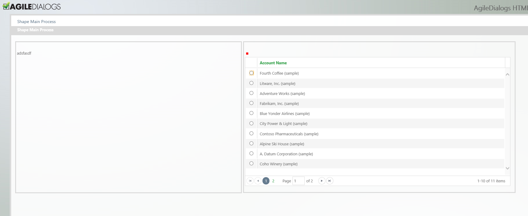
Figure 7. “Height” property set in the first group container, to match the same height of the second group container