AgileDialogs common control properties
Home –> AgileDialogs design guide –> AgileDialogs common control properties
- ValueVariable: This is the name of the variable which will store the control value into process context.
The
ValueVariablevalue will be stored in process context whenNextbutton was clicked.
TheValueVariablevalue can be used typing${ValueVariable}.
TheValueVariablevalue also is used in all references to AgileDialogs API. - DisplayVariable: This is name of the variable which will store the display value of the control into process context.
The
DisplayVariableproperty is not available for all controls. Only for controls, like combo, that display one value and store another. - Required: This property defines if control data is mandatory.
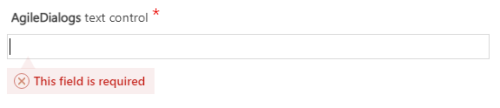
- ValidationMessage: This property allow customize the validation message shown to the user when a required control validation fails.
-
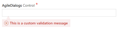
CustomValidationMessage: This property allow customize the validation message shown to the user when a custom validation fails.
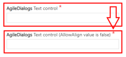
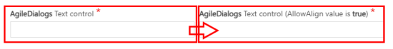
- AllowAlign: This property allows you to define the way the control is displayed on the page.
If the value of
AllowAlignproperty isfalse, the control will be presented stacked with respect to the previous control.
If the value ofAllowAlignproperty istrue, the control will be rendered inline with respect to the previous control.
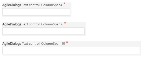
- ColumnSpan: This property defines the width of the control into the screen. Value must be between 1 (min) and 12(max).
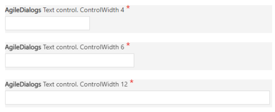
- ControlWidth: This property defines the width of the input field into the control. Value must be between 1 (min) and 12(max).
- Question: This property allow define the control caption.
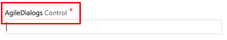 When a control is required, AgileDialogs adds a visual required indicator. This indicator and its position can be modified through style customization.
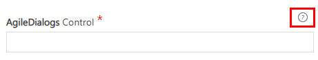
 - Notes: This property allow define the help for control. When this property has value, a help icon will be shown and clicking on it help its shown.
-
DefaultValue: This property allows set a default value for the control.
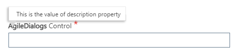
- Description: This property allows set a context help for the control. When control receives the focus this help will shown.
- IsReadOnly: This property defines if control executes in readonly mode.
When control has the
ReadOnlyproperty set totrue, all validations for the control are disabled. This occurs to avoid blocking the user by applying validations to a control that they cannot manipulate. - Visible: This property defines if control is visible or not.
When control has the
Visibleproperty set tofalse, all validations for the control are disabled. This occurs to avoid blocking the user by applying validations to a control that they cannot manipulate. - CssClass: This property allows adding CSS classes to the control, in this way we can customize how each control is displayed.