AgileDialogs Customization Guide
Home –> AgileDialogs Customization Guide
Overview
AgileDialogs allows customization of look & feel.
AgileDialogs customization is based on themes. A theme is a LESS file which defines the look & feel of the AgileDialogs pages.
LESS is a CSS preprocessor that extends the standard CSS language by adding variables, rule nesting, mixins, and math operations.
CSS knowledge is required to customize AgileDialogs
By default, AgileDialogs has a set of six of themes available, but custom themes can be created from scratch or based on an existing theme.
AgileDialogs can be customized by either:
Configure which AgileDialogs Theme to use
To configure the AgileDialogs theme used, go to the AgileXRM Administration tool in the AgileDialogs section of the Integration Settings tab. To set a Theme for AgileDialogs, simply type the name of the Theme in the corresponding field.
Invalid theme names will be ignored and AgileDialogs will be rendered using the default theme
AgileDialogs out-of-the-box themes
By default AgileDialgos provides these themes:
| Theme.uui | Theme.cds |
|---|---|
 |  |
| Theme.crm | Theme |
|---|---|
 |  |
| Theme.01 | Theme.02 |
|---|---|
 |  |
Layout
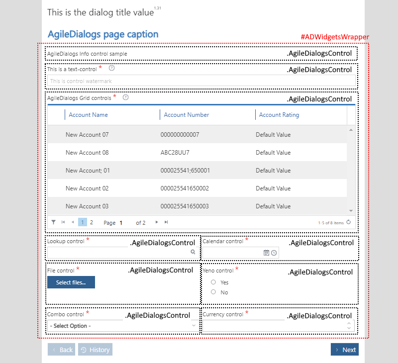
AgileDialogs Page Layout
Basically customizing AgileDialogs is all about creating a custom CSS until the desired look feel is achieved.
Customizing AgileDialogs is achieved by overriding the default behaviour with custom CSS. So, it is necessary to understand the page layout in order to write the new CSS rules.
AgileDialogs is a SPA (Single Page Application). This means that AgileDialogs loads a unique Page Layout, and dynamically updates its content.
This image represents the AgileDialogs page layout:
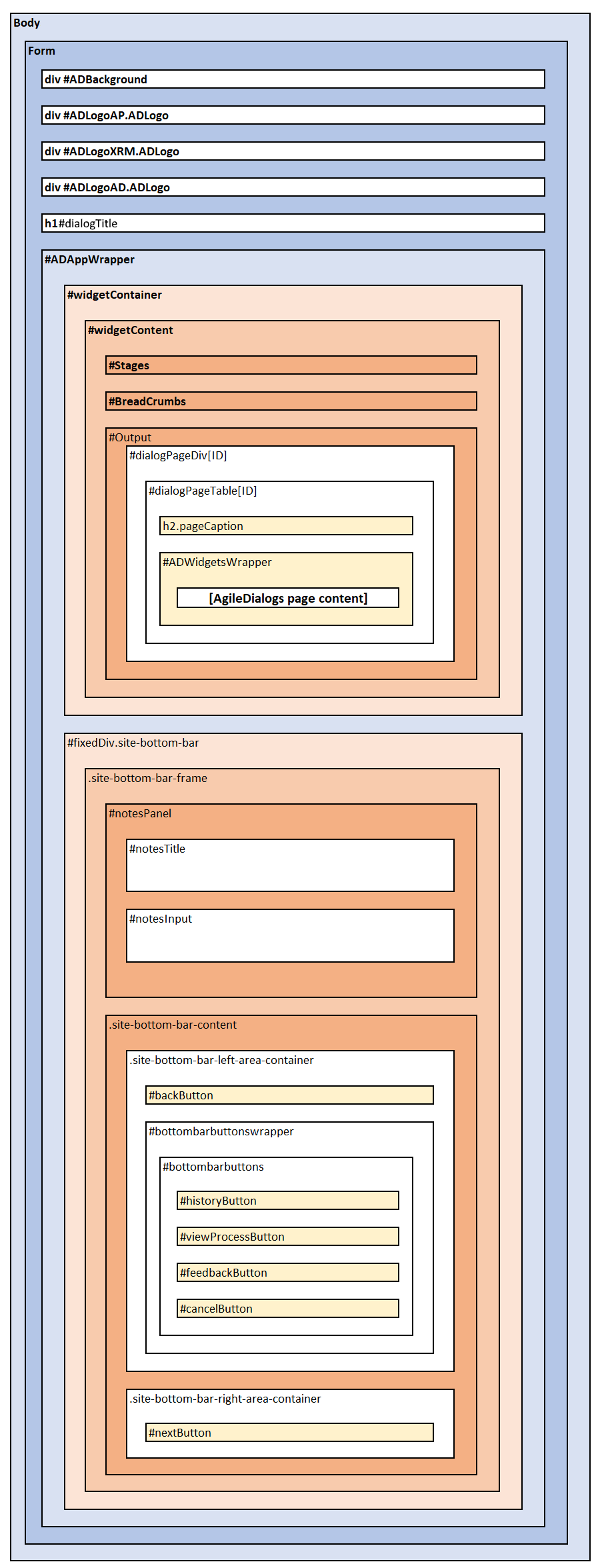
AgileDialogs uses this page layout for all pages, and updates page content with the controls that were defined when modelling the dialog in Visio.
Some advanced functionalities, such as Popup Render, use a different DOM layout, but they maintain the same CSS selectors.
| CSS Selector | Description |
|---|---|
| #ADBackground | Background image. Hidden by default |
| #ADLogoAP.ADLogo | Logo 1. Hidden by default |
| #ADLogoXRM.ADLogo | Logo 2. Hidden by default |
| #ADLogoAD.ADLogo | Logo 3. Hidden by default |
| h1#dialogTitle | This element shows AgileDialogs Title. Only visible when not hosted |
| #ADAppWrapper | This section contains the following three element |
| #Output | This section is where AgileDialogs page will be rendered |
| h2.pageCaption | Page Title |
| #ADWidgetsWrapper | This is the element where all controls defined in a Page will be shown |
AgileDialogs page layout is represented in this image:
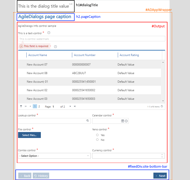
Note: AgileDialogs Title is hidden when it is executed using hosted=1 parameter
AgileDialogs page content is dynamically built from process model definition.
Each control is rendered within #ADWidgetsWrapper element in its own .AgileDialogsControl element.
This image represents this concept:
Every control in AgileDialogs page has the CSS class .AgileDialogsControl and its own layout.
Also, each AgileDialgs control has a CssClass property that allows customizing the controls individually.
See CssClass Property in this document: Common Properties
AgileDialogs Control Layout
When modelling an AgileDialogs Page, controls are added and configured to show and get data from the user.
Each of the controls has its own layout like this:
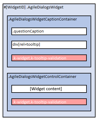
| CSS Selector | Description |
|---|---|
| .AgileDialogsWidget | The container of each control. The ID attribute depends on the proces model template |
| .AgileDialogsWidgetCaptionContainer | Where control caption is rendered. Also contains the control help and validation elements |
| .questionCaption | The control’s label |
| div[rel=tooltip] | The control’s help |
| .k-widget.k-tooltip-validation | This is the element which render the control help XX |
| .AgileDialogsWidgetControlContainer | The control’s inputs. Each control renders this part and has its own CSS class to identity it |
| .k-widget.k-tooltip-validation | The validation message |
Note: .k-widget.k-tooltip-validation can be located inside of .AgileDialogsWidgetCaptionContainer element, or inside .AgileDialogsWidgetControlContainer, but not in both at the same time When an AgileDialogs control is configured as Required, the .questionCaption element also has a .required CSS class.
AgileDialogs control layout is represented in this image:
Control output varies depending on the kind of data to show and on control configuration. Therefore the content of .AgileDialogsWidgetControlContainer element varies by control type and its configuration.
For instance, a Text Control with the Watermark property set, would render with addicional element to show the watermark. Similarly, if the control was configured as Multiline, it would be rendered with a textarea element instead of an input element.
Listed below are the AgileDialogs Controls and their content layout.
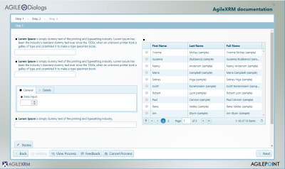
Info Control Layout
Below image represents Info Control layout:
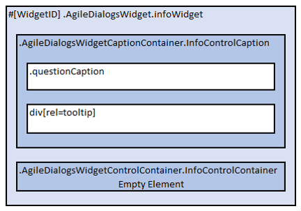
Note: AgileDialogs Info control does not contains .k-widget.k-tooltip-validation element
Below list represents Info Control layout:
- .AgileDialogsWidget
- .AgileDialogsCaptionContainer.InfoControlContainer
- .questionCaption
- div[rel=tooltip]
- .AgileDialogsControlContainer.InfoControlContainer
- .AgileDialogsCaptionContainer.InfoControlContainer
See here: Info control
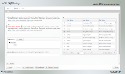
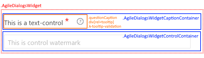
Text Control Layout
Below image represents Text Control layout:
Below list represents Text Control layout:
- .AgileDialogsWidget
- .AgileDialogsCaptionContainer.TextControlCaption
- .questionCaption
- div[rel=tooltip]
- .AgileDialogsControlContainer.TextControlContainer
- input | textarea
- .k-widget.k-widget-validation
- .watermark
- .AgileDialogsCaptionContainer.TextControlCaption
See here: Text control
Numeric Control Layout
Below image represents Numeric Control layout:
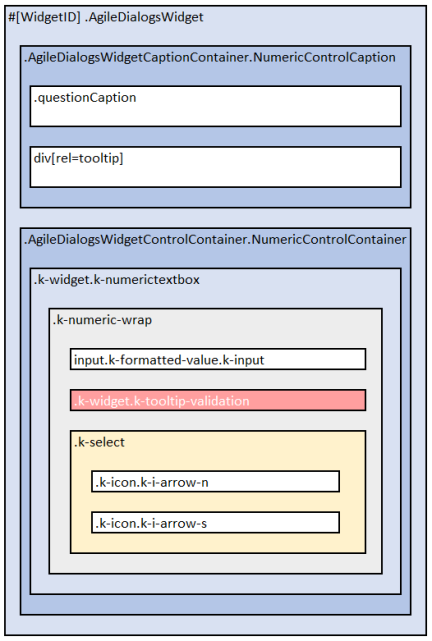
Below list represents Numeric Control layout:
- .AgileDialogsWidget
- .AgileDialogsCaptionContainer.NumericControlCaption
- .questionCaption
- div[rel=tooltip]
- .AgileDialogsControlContainer.NumericControlContainer
- .k-widget.k-numerictextbox
- .k-numeric-wrap
- input.k-input.k-formatted-value
- .k-widget.k-tooltip-validation
- .k-select
- .k-icon.k-i-arrow-n
- .k-icon.k-i-arrow-s
- .k-numeric-wrap
- .k-widget.k-numerictextbox
- .AgileDialogsCaptionContainer.NumericControlCaption
See here: Numeric control
Currency Control Layout
Below image represents Currency Control layout:
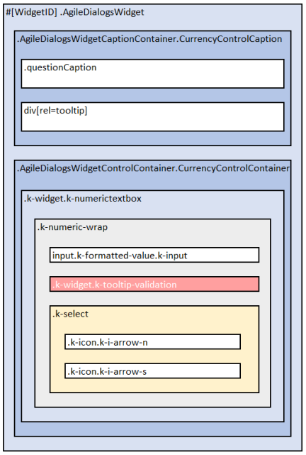
Below list represents Currency Control layout:
- .AgileDialogsWidget
- .AgileDialogsCaptionContainer.CurrencyControlCaption
- .questionCaption
- div[rel=tooltip]
- .AgileDialogsControlContainer.CurrencyControlContainer
- .k-widget.k-numerictextbox
- .k-numeric-wrap
- input.k-input.k-formatted-value
- .k-widget.k-tooltip-validation
- .k-select
- .k-icon.k-i-arrow-n
- .k-icon.k-i-arrow-s
- .k-numeric-wrap
- .k-widget.k-numerictextbox
- .AgileDialogsCaptionContainer.CurrencyControlCaption
See here: Currency control
Combo Control Layout
Below image represents Combo Control layout:
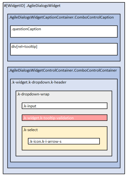
Important: AgileDialogs internally uses KendoUI framework, hence the control layout is not as one can expect using select tag, instead, options are rendered before document end in .k-animation-container element
Below list represents Combo Control layout:
- .AgileDialogsWidget
- .AgileDialogsCaptionContainer.ComboControlContainer
- .questionCaption
- div[rel=tooltip]
- .AgileDialogsControlContainer.ComboControlContainer
- .k-widget.k-dropdown.k-header
- .k-dropdown-warp
- .k-input
- .k-widget.k-tooltip-validation
- .k-select
- .k-icon.k-i-arrow-s
- .k-dropdown-warp
- .k-widget.k-dropdown.k-header
- .AgileDialogsCaptionContainer.ComboControlContainer
- …
- .k-animation-container
- .k-list-container
- ul
- li
- …
- li
- ul
- .k-list-container
See here: Combo control
See here: Animation container
Radio Button Control Layout
Below image represents radio Control layout:
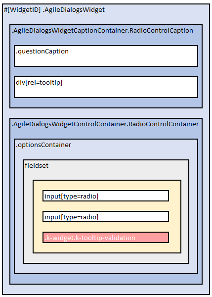
Below list represents Radio button Control layout:
- .AgileDialogsWidget
- .AgileDialogsCaptionContainer.RadioControlContainer
- .questionCaption
- div[rel=tooltip]
- .AgileDialogsControlContainer.RadioControlContainer
- .optionsContainer
- fieldset
- input[type=radio]
- …
- input[type=radio]
- .k-widget.k-tooltip-validation
- fieldset
- .optionsContainer
- .AgileDialogsCaptionContainer.RadioControlContainer
See here: Radio Button
Checkbox Control Layout
Below image represents Checkbox Control layout:
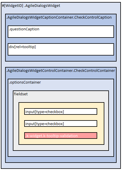
Below list represents Checkbox Control layout:
- .AgileDialogsWidget
- .AgileDialogsCaptionContainer.CheckControlContainer
- .questionCaption
- div[rel=tooltip]
- .AgileDialogsControlContainer.CheckControlContainer
- .optionsContainer
- fieldset
- input[type=check]
- …
- input[type=check]
- .k-widget.k-tooltip-validation
- fieldset
- .optionsContainer
- .AgileDialogsCaptionContainer.CheckControlContainer
See here: Checkbox
Yes/No Control Layout
Below image represents Yes/No Control layout:
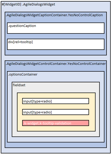
Below list represents Yes/No Control layout:
- .AgileDialogsWidget
- .AgileDialogsCaptionContainer.YesNoControlContainer
- .questionCaption
- div[rel=tooltip]
- .AgileDialogsControlContainer.YesNoControlContainer
- .optionsContainer
- fieldset
- input[type=radio]
- input[type=radio]
- .k-widget.k-tooltip-validation
- fieldset
- .optionsContainer
- .AgileDialogsCaptionContainer.YesNoControlContainer
See here: Yes/No
Calendar Control Layout
Below image represents Calendar Control layout:
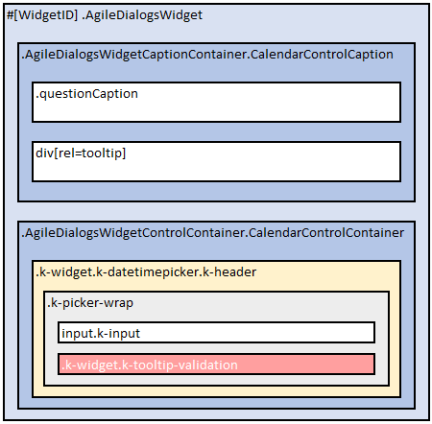
Important: AgileDialogs internally uses KendoUI framework, hence the control layout is not as one can expect, calendar elements are rendered before document end in .k-animation-container element
Below list represents Calendar Control layout:
- .AgileDialogsWidget
- .AgileDialogsCaptionContainer.CalendarControlContainer
- .questionCaption
- div[rel=tooltip]
- .AgileDialogsControlContainer.CalendarControlContainer
- .k-widget.k-datetimepicker.k-header
- .k-picker-wrap.k-state-default
- input.k-input
- .k-widget.k-tooltip-validation
- .k-icon.k-warning
- .k-picker-wrap.k-state-default
- .k-widget.k-datetimepicker.k-header
- .AgileDialogsCaptionContainer.CalendarControlContainer
See here: Calendar
See here: Animation container
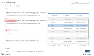
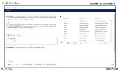
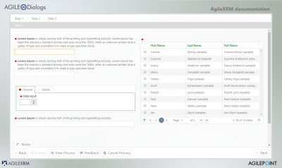
Lookup Control Layout
Below image represents Lookup Control layout:
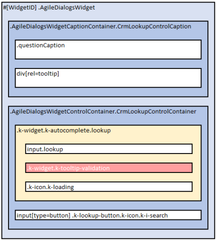
Below list represents Lookup Control layout:
- .AgileDialogsWidget
- .AgileDialogsCaptionContainer.CrmLookupControlContainer
- .questionCaption
- div[rel=tooltip]
- .AgileDialogsControlContainer.CrmLookupControlContainer
- .k-widget.k-autocomplete.lookup
- input.lookup
- .k-widget.k-tooltip-validation
- .k-icon.k-loading
- input[type=button] .k-lookup-button.k-icon.k-i-search
- .k-widget.k-autocomplete.lookup
- .AgileDialogsCaptionContainer.CrmLookupControlContainer
Also, check lookup window in this document: Lookup window
See here: Lookup
See here: Animation container
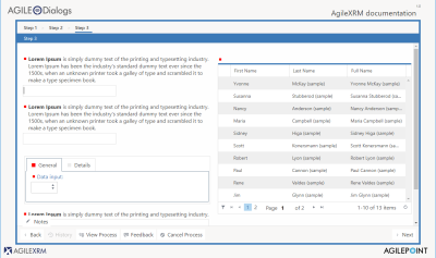
Grid Control Layout
Below image represents Grid Control layout:
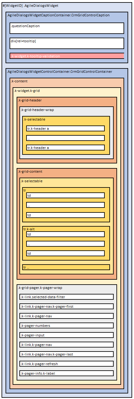
Note: Selected row has .k-state-selected class
Below list represents Grid Control layout:
- .AgileDialogsWidget
- .AgileDialogsCaptionContainer.CrmGridControlContainer
- .questionCaption
- div[rel=tooltip]
- .k-widget.k-tooltip-validation
- .AgileDialogsControlContainer.CrmGridControlContainer
- .k-content
- .k-widget.k-grid
- .k-grid-header
- .k-grid-header-wrap
- .k-selectable
- .k-header
- .k-selectable
- .k-grid-header-wrap
- .k-grid-content
- .k-selectable
- td
- span
- td.k-alt
- span
- …
- td
- .k-selectable
- .k-grid-pager
- .k-link.selected-data-filter
- .k-link.k-pager-nav.k-pager-first
- .k-link.k-pager-nav
- .k-pager-numbers
- .k-pager-input
- .k-link.k-pager-nav
- -k-link.k-pager-nav.k-pager-last
- .k-link.k-pager-refresh
- .k-pager-info.k-label
- .k-grid-header
- .k-widget.k-grid
- .k-content
- .AgileDialogsCaptionContainer.CrmGridControlContainer
See here: Grid
File Control Layout
Below image represents File Control layout:
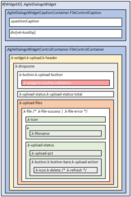
Below list represents File Control layout:
- .AgileDialogsWidget
- .AgileDialogsCaptionContainer.FileControlContainer
- .questionCaption
- div[rel=tooltip]
- .AgileDialogsControlContainer.FileControlContainer
- .k-widget.k-upload.k-header /*.k-upload-empty */
- .k-dropzone
- .k-button.k-upload-button
- .k-widget.k-tooltip-validation
- .k-upload-status.k-upload-status-total
- .k-upload-files
-
.k-file /* .k-file-success .k-file-error */ - .k-icon
- a
- .k-filename
- .k-upload-status
- .k-upload-pct
- .k-button.k-button-bare.k-upload-action
- .k-icon.k-delete /* .k-refresh */
-
- .k-button.k-upload-button
- .k-dropzone
- .k-widget.k-upload.k-header /*.k-upload-empty */
- .AgileDialogsCaptionContainer.FileControlContainer
See here: File
Password Control Layout
Below image represents Password Control layout:
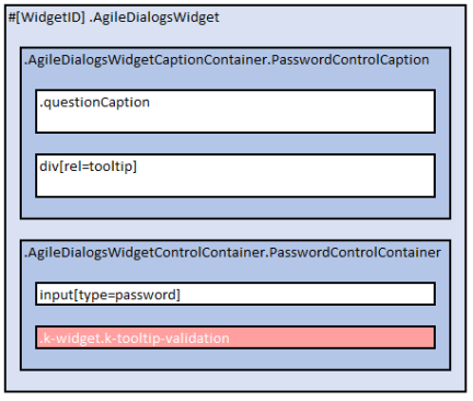
Below list represents Password Control layout.
- .AgileDialogsWidget
- .AgileDialogsCaptionContainer.PasswordControlContainer
- .questionCaption
- div[rel=tooltip]
- .AgileDialogsControlContainer.PasswordControlContainer
- input[type=password]
- .k-widget.k-tooltip-validation
- .AgileDialogsCaptionContainer.PasswordControlContainer
See here: Password
Tab Container Control Layout
Below image represents Tab Container Control layout:
Below list represents Tab container Control layout:
- .AgileDialogsWidget
- .AgileDialogsCaptionContainer.TabContainerControlContainer
- .questionCaption
- div[rel=tooltip]
- .AgileDialogsControlContainer.TabContainerControlContainer
- .k-tabstrip-wrapper
- .k-widget.k-tabstrip.k-header.tabs-container
- ul.k-tabstrip-items
- li.k-item
- a.k-link
- …
- li.k-item
- li.k-item
- .k-content.tab-item /* .k-state-active */
- .AgileDialogsWidget
- …
- .AgileDialogsWidget
- …
- .k-content.tab-item /* .k-state-active */
- .AgileDialogsWidget
- …
- .AgileDialogsWidget
- ul.k-tabstrip-items
- .k-widget.k-tabstrip.k-header.tabs-container
- .k-tabstrip-wrapper
- .AgileDialogsCaptionContainer.TabContainerControlContainer
Tab container control will contains as many li.k-item as tabs have been defined.
If tab contains empty required controls inside, the li.k-item element will has the .has-required-inputs CSS class , otherwise will has .no-required-inputs CSS class. Tab container control will contains as many .k-content.tab-item as tabs have been defined.
Each tab-item will contain as many .AgileDialogsWidget elements as have been defined in Visio.
See here: Tab container control
Group Container Control Layout
Below image represents Group Container Control layout:
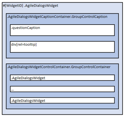
Note: AgileDialogs Group control does not contains .k-widget.k-tooltip-validation element
Below list represents Group Container Control layout:
- .AgileDialogsWidget
- .AgileDialogsCaptionContainer.GroupContainerControlContainer
- .questionCaption
- div[rel=tooltip]
- .AgileDialogsControlContainer.GroupContainerContainer
- .AgileDialogsWidget
- …
- .AgileDialogsWidget
- .AgileDialogsCaptionContainer.GroupContainerControlContainer
AgileDialogs group control contains as many .AgileDialogsWidget elements as controls that have been added at design time.
When AgileDialogs group control is configured withGroupTypeproperty set to fieldset, the controls will be rendered wrapped inside a fieldset element.
See here: Group container control
IFrame Control Layout
Below image represents IFrame Control layout:
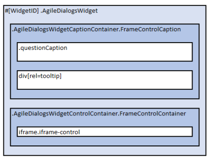
Note: AgileDialogs IFrame control does not contains .k-widget.k-tooltip-validation element
Below list represents IFrame Control layout:
- .AgileDialogsWidget
- .AgileDialogsCaptionContainer.FrameControlContainer
- .questionCaption
- div[rel=tooltip]
- .AgileDialogsControlContainer.FrameControlContainer
- iframe.iframe-widget
- .AgileDialogsCaptionContainer.FrameControlContainer
See here: IFrame control
HTML Control Layout
Below image represents HTML Control layout:
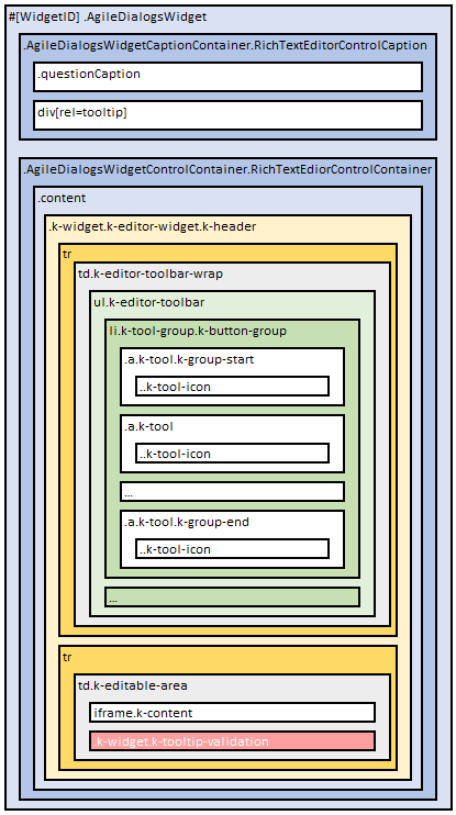
Below list represents HTML Control layout:
- .AgileDialogsWidget
- .AgileDialogsCaptionContainer.RichTextEdiorControlContainer
- .questionCaption
- div[rel=tooltip]
- .AgileDialogsControlContainer.RichTextEdiorControlContainer
- .content
- .k-widget.k-editor-widget.k-header
- tr
- td.k-editor-toolbar-wrap
- ul.k-editor-toolbar
- li.k-tool-group.k-button-group
- a.k-tool.k-group-start
- .k-tool-icon
- a.k-tool
- .k-tool-icon
- …
- a.k-tool.k-group-end
- .k-tool-icon
- a.k-tool.k-group-start
- …
- li.k-tool-group.k-button-group
- a.k-tool.k-group-start
- .k-tool-icon
- a.k-tool
- .k-tool-icon
- …
- a.k-tool.k-group-end
- .k-tool-icon
- a.k-tool.k-group-start
- li.k-tool-group.k-button-group
- ul.k-editor-toolbar
- td.k-editor-toolbar-wrap
- tr
- td.k-editable-area
- iframe.k-content
- .k-widget.k-tooltip-validation
- td.k-editable-area
- tr
- .k-widget.k-editor-widget.k-header
- .content
- .AgileDialogsCaptionContainer.RichTextEdiorControlContainer
See here: HTML Control
Create a new Theme
Creating a new theme is done in this way:
- Create a new .less file (mytheme.less)
- Assign new values to needed variables
- Write custom CSS rules, if needed
- Deploy the theme
In this file set values for needed variables:
@widget-background-color: #ffffff;
@widget-border-color: #94c0d2;
@widget-text-color: #003f59;
@header-background-color: #daecf4;
@header-text-color: #003f59;
@button-background-color: #daecf4;
@button-text-color: #003f59;
@group-background-color: #daecf4;
@group-border-color: #94c0d2;

/* Full variable list */
It is possible to include in the theme, all elements that are needed: CSS rules, mixings, new variables …
See AgileDialogs Customization variables list here: AgileDialogs Customization variables list
When custom theme is ready, it can be tested in these ways:
- Set theme parameter to the theme name in the query string. This only applies to the particular dialog being run
For example:
https://domain.com/…/AgileDialogsKendoRuntime.aspx?…&theme=mytheme - Configure AgileDialogs theme using AgileXRM Administration tool and set theme name as value.
This setting will apply to all dialogs.
Inherit an exiting theme
It is also possible to inherit from an existing theme assinging @extends-theme variable, by this way:
@extends-theme: "theme.uui";

@font-family: 'Candara', 'Candara Light';
@widget-font-size: 1.2rem;
Customize existing theme from the Process Modeler
It is possible to customize an existing theme, overriding it with Custom CSS. From Process Modeller, open the CSS Editorfrom the AgileXRM Ribbon.
This method of customization only supports CSS. LESS is not supported.
#ADAppWrapper #ADWidgetsWrapper .AgileDialogsWidget .k-widget.k-tooltip-validation {
  width: 100%;
  font-style: italic;
  border: none;
  margin: 0;
  padding: 2px;
  display: block;
  box-shadow: none;
  background-color: #ffffff;
  color: #cf114d;
  top: 1rem;
}

.my.control-01{

    background-color: #0000FF;
}

.my.control-02{

    background-color: #00FF00;
}

.my.control-03{

    background-color: #FF0000;
}
A theme can block its customization using @allow-custom-css variable.
Customize AgileDialogs Pages individually
AgileDialogs Pages can be customized individually by CssClass property.
To do so, set the CssClass property under Page Settings tab in AgileDialogs page editor.
The property value will be added to #ADWidgetsWrapper element, so if the value of CssClass is “my-form” , it can be customizeed in this way:
#ADWidgetsWrapper.my-form
{
    background-color: #c1e7ea4d;
}
Also, pseudo-elements can be used to prevent CSS affecting controls overlay:
#ADWidgetsWrapper.my-form::before {
    height: 100%;
    width: 100%;
    content: " ";
    background-image: url(https://media.domain.com/.../image.png);
    position: absolute;
    z-index: -1;
    background-size: contain;
}
Customize AgileDialogs Controls individually
AgileDialogs Controls can be customized individually by CssClass property.
To do so, set the CssClass property in the Control’s property grid.
The property value will be added to .AgileDialogsWidget element of the control, so if the value of CssClass is “my-control” , it can be customizeed in this way:
.AgileDialogsWidget.my-control
{
    background-color: #c1e7ea4d;
    padding-left:1rem;
}
Customize AgileDialogs breadcrumbs
Breadcrumbs is a list of links to allow the user to go pack to a previous page by clicking the link.
Breadcrumbs must be enabled in the process model template, otherwise they will not be displayed.
To enable bradcrumbs check theShow Bredcrumbsoption in process settings window.
Check: Breadcrumns
Breadscrumbs
Breadcrumbs are rendered into #BreadCrumbs element. Each page adds it own breadcrumb, into #BreadCrumbsSteps .breadCrumbsTemplateLink, except the last breascrumb (active page) which is rendered #BreadCrumbsSteps span:last-child.
Bradscrumbs are render into #BreadCrumbs element
#BreadCrumbs {
    background-color:#10a3a3 !important;
}

#BreadCrumbsSteps .breadCrumbsTemplateLink {
    color: #f7f7f7 !important;
}

#BreadCrumbsSteps span:last-child {
    font-size:2rem;
}

/* Breadcrumbs separation icon */
#BreadCrumbsSteps span:after {
    content: ">";
    font-size: 1.5rem;
    color: red ;
}
When breadcrumbs overwide the available space, oldest breadcrumbs are hidden, and [+] button is shown. Clicking that button will expand the hidden breadcrumbs and a [-] button is shown. Can customize [+] and [-] buttons by this way:
#BreadCrumbs .k-button.showmore .{
  border-color: #fff !important;
  background-color: #FFF!important;
}

#BreadCrumbs .k-button.showless {
  border-color: #fff !important;
  background-color: #FFF!important;
}
Customize animation containers
Many AgileDialogs controls internally use KendoUI framework.
These controls’ layout is not as one expects, instead, elements are rendered before document ends within .k-animation-container element.
Listed below customization samples:
–
Customize AgileDialogs windows
Lookup window
AgileDialogs lookup window is shown from AgileDialogs lookup controls when popup button is clicked.
Can customiza by this way;
.lookup-window .k-header
{
    /* Custom CSS ... */
}

#lookupWindow .top
{
    /* Custom CSS ... */
}

#lookupWindow .body
{
    /* Custom CSS ... */
}

#lookupWindow .bottom
{
    /* Custom CSS ... */
}

#lookupFilterButton
{
    /* Custom CSS ... */
}
Validation window
AgileDialogs validation window is shown from AgileDialogs validation (usually before navigation).
Can customize by this way:
#messageWindow
{
    /* Custom CSS ... */
}

#messageContent
{
    /* Custom CSS ... */
}

#messageWindow .message-content-buttons
{
    /* Custom CSS ... */
}
Confirmation window
This window is shown when AgileDialogs needs user confirmation. Examples of this are navigation confirmation from history, cancel current process …
Can customize by this way:
#confirmWindow
{
    /* Custom CSS ... */
}

#confirmHistoryContent
{
    /* Custom CSS ... */
}

#confirmCancelProcessContent
{
    /* Custom CSS ... */
}

#confirmExitContent
{
    /* Custom CSS ... */
}
Messaging window
This window is shown when AgileDialogs shows messages to user from DialogsEngine API.
Can customize by this way.
#messageWindow
{
    /* Custom CSS ... */
}

#messageContent
{
    /* Custom CSS ... */
}

.message-content-buttons
{
    /* Custom CSS ... */
}

#closeMessageWindowButton
{
    /* Custom CSS ... */
}
Progress window
AgileDialogs Progress window can be customizeed in this way:
#ADAppWrapper .imageSpin .notification-wrap .notification-text{
    font-style: italic;
}

#ADAppWrapper .imageSpin .notification-wrap .notification-advance{
    font-size: 3rem;
}

#ADAppWrapper .imageSpin .notification-wrap .notification-bar{
    background-color: rgb(206 18 162 / 65%);
}
Also, from Process Modller Progress Message Editor, a custom CssClass can be set for each message. So say, for “my-class” as class name, it can be customized in this way:
#ADAppWrapper .imageSpin.my-class .notification-wrap .notification-text{
    font-style: italic;
}

#ADAppWrapper .imageSpin.my-class .notification-wrap .notification-advance{
    font-size: 3rem;
}

#ADAppWrapper .imageSpin.my-class .notification-wrap .notification-bar{
    background-color: rgb(206 18 162 / 65%);
}
Notes window
This window is shown when “Enable feedback funcionality” and Feedback button is clicked.
Can customize by this way:
#notesWindow {
    /* Custom CSS ... */
}
Customization Samples
Customize Loading Spinner
AgileDialogs loading spinner can be customized in this way:
#ADAppWrapper .imagespin
{
    background: rgba(255, 255, 255, 0.8)
                url(https://media.tenor.com/oGoY4h0pGYUAAAAi/updatess.gif)
                no-repeat
                center
                center
                !important;
}
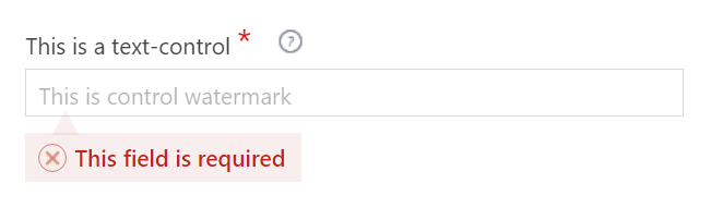
Customize validation message
AgileDialogs validation message can be customized in these ways:
Assigning variable values:
@validation-background-color: #d3dbf8;
@validation-border-color: #d3dbf8;
@validation-text-color: #173ab7;
Or override the CSS rule and extend it:
#ADWidgetsWrapper .AgileDialogsWidget .k-widget.k-tooltip-validation
{
    border-color: #0cd7f3;
    background-color: #0e3762;
    color: #fff;
    z-index:10000;
}

#ADWidgetsWrapper .AgileDialogsWidget .k-widget.k-tooltip-validation .k-icon.k-warning
{
        background-image: url(https://repository-images.githubusercontent.com/107711917/48e09b00-a983-11e9-9733-7240916c8197);
        background-position: -52px -534px !important;
        background-repeat: no-repeat;
        height: 2.5rem;
        width: 2.5rem;
        border-radius: initial !important;
        filter: none !important;

}

#ADWidgetsWrapper .AgileDialogsWidget .k-widget.k-tooltip-validation::after {
    color: #ffa500;
    content: "▲";
    position: absolute;
    font-size: 22px;
    top: -23px;
    left: 15px;
    opacity: 0.5;
    zoom:0.5;
}
Customize Required indicator
AgileDialogs shows an icon to identify required fields. This element can be customized using the CSS pseudo-elements ::before and ::after
To place the Required icon on the left-side, use a CSS snippet like this:
#ADWidgetsWrapper .AgileDialogsWidget .questionCaption.required::before
{
    color: #ea0600 !important;
    content: "*" !important;
    font-size: 21px !important;
    top: 0.5rem !important;
    padding-left: 4px;
    line-height: 0.5rem;
}
To place the Required icon on the right-side, use a CSS snippet like this:
#ADWidgetsWrapper .AgileDialogsWidget .questionCaption.required::after
{
    color: #ea0600 !important;
    content: "*" !important;
    font-size: 21px !important;
    top: 0.5rem !important;
    padding-left: 4px;
    line-height: 0.5rem;
}
Customize Help icon
To customize AgileDialogs help icon use a CSS snippet like this:
#ADWidgetsWrapper .AgileDialogsWidget.hastooltip div[rel=tooltip] .widget-help-click-image
{
    background: url(https://.../myimage.png);
    background-size: contain;
}
Customize Page Title
To customize Page Title, use a CSS snippet like this:
h1#dialogTitle {
    color: #5248a1;
    font-style: italic;
}
Not visible when in Hosted mode
Customize Page Caption
#ADAppWrapper #widgetContainer #Output h2.pageCaption {
    color: #b73b65 !important;
    background-color: #ffffff !important;
    padding-left: 10px;
}
Customize background image
#ADBackground {
    display: block !important;
}

#ADBackground span {
        display: inherit;
        background-image: url("https://.../myimage.png") !important;
        background-size: 100% 100%;
        height: 100%;
        position: absolute;
        width: 100%;
    }
Customize form margins
Assigning value for @ad-centered-margin-background-color variable (only can be used in theme file):
@ad-centered-margin-background-color: #246dbb
Overrinding the CSS rules:
div#ADAppWrapper::before {
    background-color: red !important;
}
div#ADAppWrapper::after {
    background-color: yellow!important;
}
Customize Combo control items
AgileDialogs combo control renders its items into animation container.
Can customize by this way:
#ADAppWrapper #widgetContainer #Output
    .AgileDialogsWidget .ComboControlContainer
        .k-dropdown .k-dropdown-warp
{
    /* Custom css */
}

.k-animation-container .k-list-container ul.k-list li.k-item
{
  background-color:green;
  color:red;
}
Important: The customizations of the combo control items will also affect the inline items of the lookup control.
Customize Lookup control items
AgileDialogs lookup control renders inline search results into animation container.
Can customize by this way:
#ADAppWrapper #widgetContainer #Output
    .AgileDialogsWidget .CrmLookupControlContainer
        .k-dropdown .k-dropdown-warp
{
    /* Custom css */
}

.k-animation-container .k-list-container ul.k-list li.k-item
{
  background-color:green;
  color:red;
}
Important: The customizations of the lookup control inline items will also affect the items of the combo control.
Customize Calendar control items
AgileDialogs calendar control renders its items into animation container.
Can customize by this way:
#ADAppWrapper #widgetContainer #Output
    .AgileDialogsWidget .CalendarControlContainer
        .k-datetimepicker .k-picker-wrap
{
    /* Custom css */
}

.k-animation-container .k-calendar-container .k-calendar .k-header
{
  background-color:#6ba76b;
  color:#c08a8a;
}

.k-animation-container .k-calendar-container .k-calendar .k-content
{
  background-color:#9ecbe2;
  color:#370372;
}

.k-animation-container .k-calendar-container .k-calendar .k-footer
{
  background-color:#e29ebf;
  color:#e8e3ed;
}